
The Top 3 Examples of Successful Subscription Apps (and Why!)
By Jeremi Orlowski, Yodel Mobile
Subscription models are on the rise amongst mobile apps. This reflects a growing change in the way app businesses view the relationship they have with consumers; they are increasingly seeking to build long-term connections rather than pursuing high-volume, low-quality user acquisition numbers.
Subscription apps require app businesses to rightly prioritize user retention and engagement in their app marketing strategies. After all, the longer a user remains committed to a subscription app, the higher the total ROI for that user becomes. This requires app businesses to put in place app marketing strategies that effectively educate users on the app’s purpose and keep drawing users back into the app through the production of new content and a solid communication strategy.
A smooth user journey can not only help to build a relationship with users and educate them, but it can also go a long way to getting users to take the jump from free trial explorer to loyal subscriber. We have put together three examples of successful subscription apps and highlighted the user journey to the point of subscription to showcase the key success factors that have led to their acquisition of paying users.
1. PictureThis
User Journey
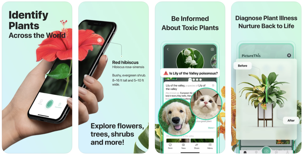
PictureThis is a plant identification and analysis app with a subscription-based freemium model. One of the first things that strikes you as a user after opening is the diversity of features instantly available and useful to the budding gardener or naturalist. Many of these are accessible and useful without a subscription, but enough features remain so as to entice the user to purchase the full subscription package. From books to poisonous plant references, to botanical expertise a click away in the ergonomic Snapchat-like UX, PictureThis is serving prospective subscribers up with an enormous platter of services that are only a fraction of its offerings. This only tempts the user to imagine what they could do with all the functionality of the app at their disposal. Better yet, all of these features are easily demystified with the app’s how-to guides and examples, while progress points spur the user on as they explore the app and its features.
PictureThis is a great example of an app that entices the user to subscribe by offering a medley of easily accessible and highly useful tools that demonstrate how impactful even a small portion of the app’s features can be: bit by bit, the user really begins to believe it when PictureThis says they have a “botanist in their pocket”.
App Marketing Strategy
PictureThis does a great job showcasing their diverse offerings, and they do an equally good job at encouraging consumers to purchase the premium subscription version of the app.
A prominent notification at the top of the home page exclaims “your free 7-day Premium hasn’t been claimed yet”, cleverly implying to users that they are missing out. On another key menu page, there is a “Gifts for Premium” section that connotes special treatment for subscribed members. Upon clicking this section, it opens to an interactive page with slides that demonstrate the key unique features of the premium version of the app.
Additionally, the opening page of PictureThis first establishes a sense of expertise and authority with a small list describing the app’s milestones, such as its impressive “App of The Day Awards” in over 100 countries. Subsequently, a 7-day free trial is offered, enticing the user to take full advantage of the app’s unique features. Crucially, the user feels a sense of safety and security with the app twice clearly explaining on the page that free cancellation is always possible within the trial.
2. Lingvist
User Journey
Lingvist is a language learning app that uses advanced technology to increase the speed at which users absorb vocabulary and progress. A cornerstone of Lingvist’s user journey is an interactive and dynamic UX that effectively explains the practicalities of using Lingvist to the user and seamlessly eases them into the process of learning a language.
Lingvist engages the user constantly by forcing them to interact with the app to unlock the next step in their user journey in a near-gamified experience. For instance, upon opening the app, an interactive infographic must be navigated by the user to reveal how learning a language translates into practical understanding and application. This visually rich interactivity is demonstrated in the screenshots below:
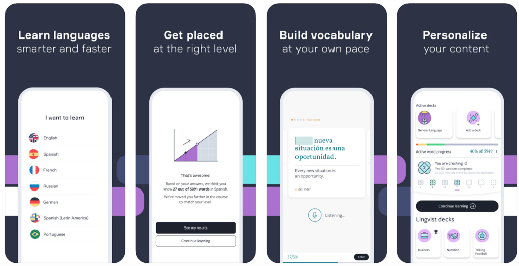
Additionally, users are encouraged to continue onwards in their language journey through the inclusion of milestones and awards, providing users with a greater sense of achievement.
App Marketing Strategy
Upon opening the app, a clear free trial and subscription option is offered, these are the focus of the page, with less emphasis placed on the free option. This is complemented by an interactive slideshow that gives the user a sense of security by clarifying the free trial can be canceled whenever needed during its course. More importantly, the app’s features and milestones are showcased next; after establishing a sense of trust, Lingvist constructs a position of authority and expertise (mentions of features in major media outlets, 6 million user milestone, Winner of the 2017 EdTex Award) while highlighting the app’s convenience and flexibility through concise multimedia descriptions of its features.
Furthermore, in the central pages of the app, a pop-up appears that encourages users to “unlock all content” with a free subscription trial. This is accompanied by subscription-only features that are exhibited on the home page to give premium features visibility; useful and interactive features are always just a touch away with Lingvist’s app.
3. Prequel
User Journey
Prequel provides users with filters and effects for photos and videos. High-quality imagery, filters, and effects, all contribute to the wonderful medley of photography that greets you upon entering Prequel. It draws you in with the promise of a first-class photographic experience hidden right behind the paywall that follows.
Accompanying this is a slideshow that illuminates the value of the app to the user, and appeals to a fear of missing out while hinting at the tantalizing aesthetic possibilities the app offers; “keep up with trends” the app encourages you. This gives the user a sense that not only would subscribing and using the app be beneficial to them but that the alternative would be a loss. This positions an app that initially might seem frivolous as an absolute essential.
![]()
It is clear that Prequel also knows its target market intricately and uses this to its advantage. Prequel has a large following of over 2 million users on TikTok, a platform dominated by Gen Z and younger millennials, with more than 60% of its users at age 24 or below. The accessible TikTok-like user interface is familiar to those who frequent social media, while post-worthy filters and effects speak loudly to a tech-savvy audience interested in channeling and finding their aesthetic through social media.
App Marketing Strategy
Prequel brings a flair to its UX that appeals to its primary audience of Gen Z’ers and Millennials. This ethos is potently reflected in its prominent social media presence on apps that Prequel content is frequently posted on: Instagram and Tiktok. This is a perceptive marketing strategy that allows Prequel to broadcast its features’ potential through posted media content to a large audience, while also targeting the user base that would be most likely to use the app.
Familiarity is also key to Prequel’s success; Netflix-like sliders of filters and effects with examples of how they could be used provide an accessible and easily understandable user interface. These accessible and interactive examples drive users to question how their world would look through Prequel’s lens, encouraging them to use the app’s features out of curiosity. Meanwhile, the photography/editing menu is formatted similarly to Tiktok (especially with the “for you page” and central media creation button). These other apps are frequently used by Prequel’s target audience of social media creators, making Prequel’s UX seamlessly intuitive to use for the vast majority of users. This user-friendliness and adjacency to social media likely results in increased user retention, as the easily understandable UX quickly becomes an integral part of any creator’s routine.
Lastly, the option to subscribe is easily accessible through a tab, with a list that displays all of the subscription version’s most important additional features. A 3-day free trial drives this home, giving users a chance to get hooked on the dazzling possibilities the app can deliver.
Optimizing Subscription Rates
Having explored three successful examples of apps that utilise subscription models, it is evident that a solid user journey goes hand-in-hand with a successful strategy to increase subscription rates and user retention. By utilizing some of the app marketing techniques and UX optimizations in your app marketing strategy, you can go a long way to provide users with enough information and insight into your app to encourage users to convert to paying subscribers.
If you want to find out more about subscription models or more general app growth, you can always contact the Yodel Mobile Growth Team with any questions you may have.
–
To learn more about what Leanplum can do for your team, check out these resources:
- Read the Just Eat Takeaway.com Case Study to see how Just Eat Takeaway.com achieved a 17% increase in total order volume
- Read our article Ten Tips to Supercharge User Engagement
- Watch our full session with Popsa, From Batch and Blast to Personalization at Scale to learn how mobile-first companies optimize engagement, experience and revenue
- We are the only engagement platform with a focus on Subscription Apps and On-Demand & Mobile Retail
- Check out the Product Tour to see Leanplum in action
- Set up a complimentary personalized demo of Leanplum
—
For app-first companies, Leanplum is the only solution that helps personalize and optimize all customer touchpoints, both inside and outside the app. Leanplum combines multi-channel Lifecycle Marketing with the ability to A/B test the Product Experience for complete, end-to-end personalization of the mobile journey. Break down organizational silos and eliminate point solutions to enable rapid growth.