
User experience (UX) and user interface (UI) go hand-in-hand. Visual designers for mobile apps usually focus on the latter: elements like icons, typography, and color all fall under UI design.
But as every good designer knows, an effective UI requires more than visual appeal. It must be accessible and intuitive. In reality, a good UI is just one component of a good UX. The reason we devote so much time and effort into optimizing our user interfaces is because they have a real impact on how users interact with the app.
Today, we’ll analyze the Soundcloud app, as part of our App Engagement Analysis series that includes the Airbnb and Etsy apps. This time, I’m paying extra attention to Soundcloud’s look and feel.
Read on for a detailed breakdown of how Soundcloud keeps users engaged with fluid app UX design.
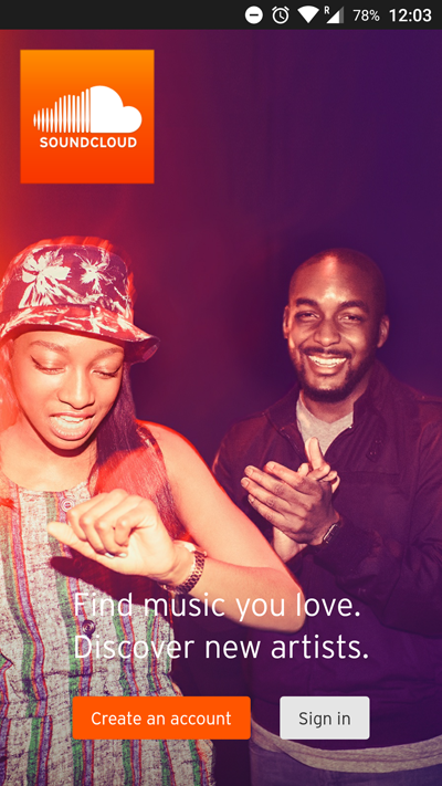
New users are greeted with a splash screen when the app is first launched. There isn’t much to comment on in terms of user experience (the account creation process is simple enough), but visually, we’re off to a good start.
This photo’s orange-tinged lighting fits the bright orange of the Soundcloud logo. And the desaturation is a plus, keeping the picture from contrasting too deeply with the interface buttons. The splash screen isn’t only intuitive; it sets the tone for what we’re about to experience.
Now let’s see what happens when we sign in!
The Discovery Tab
What Soundcloud Does Well
The first screen you encounter is the search tab, which features a plethora of ways to find new music.
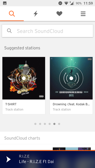
The screen can be a bit overwhelming for first-time users, but everything you might need is just a tap away. The search bar is conveniently placed at the top, suggested stations make it easy to stumble onto new tracks based on music you already like, and the Soundcloud charts let you skip straight to the day’s trending music. Crowdedness aside, the app appears to have all the functionality of the desktop website.
Scrolling down, we see a list of tags for genre-based filtering.
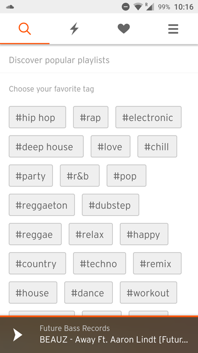
Visually, I quite like how this part of the screen is laid out. Text is a design element in itself, and this screen works despite the lack of graphics. The text for the tags is noticeably bigger than the rest, making the layout skimmable.
From a content perspective, the charts are also well designed.
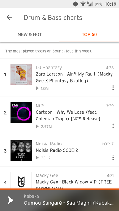
There’s seemingly nothing remarkable about this screen, but notice the little sentence above the first song? Where it explains that the Top 50 chart shows the most played tracks on Soundcloud for the week? From a usability standpoint, that’s fairly valuable.
Words like “recommended” and “trending” are used across the web these days, but often they’re euphemism for content that the platform wants to promote. In the worst cases, “recommended” content is simply paid advertising.
As a result, I’m sure I’m not the only user who approaches features like Soundcloud’s Top 50 charts with a healthy dose of skepticism. I appreciate that they take the time to explain that the chart is simply based on the play count.
One Way to Improve
Normally I’m not a big proponent of tutorials, but I can see some users struggling to learn their way around the explore tab. I’ve already used Soundcloud on desktop so it wasn’t quite as confusing for me, but there is a lot of functionality crammed into a single screen.
Perhaps the rankings and suggested stations could be spun off into their own tab, with search and tags remaining on the home tab.
The Player
What Soundcloud Does Well
The music player is the heart and soul of a music app. And I’m happy to say that Soundcloud’s player is beautifully designed.
For starters, the seekbar is intuitive, as you’ll see below.
Simply touch and hold the seekbar for the navigation to pop up. The album art is blurred and the track length is displayed in larger font, making for easy readability. It also helps that the waveform is much larger than a typical seekbar, so it’s easier to tap.
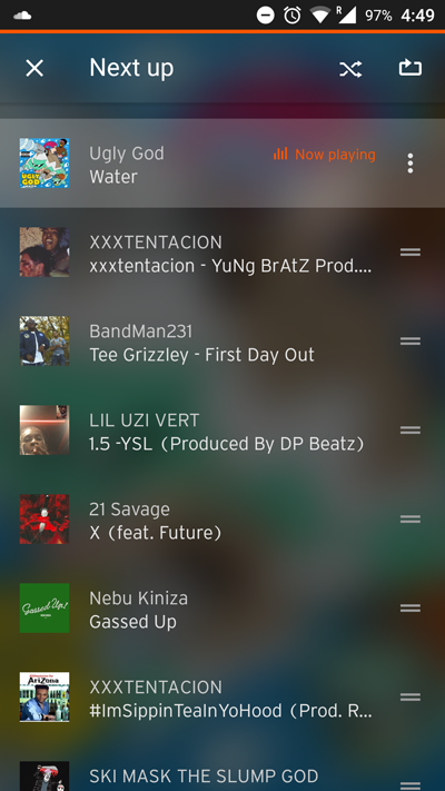
Aesthetically speaking, I love that the “next up” screen blurs the album art instead of obscuring it completely. It creates some natural variety as you browse through the playlist.
Meanwhile, you might wonder where the track info is displayed in this relatively minimal screen. It takes a couple of clicks to reach the menu, but you can pull it up without leaving the player.
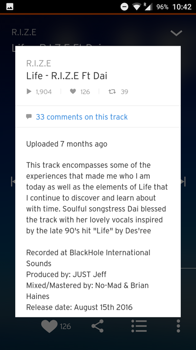
You can browse comments from this screen, and you can even leave your own comments from the menu in the bottom right.
One key feature Soundcloud offers over video platforms like Youtube is the persistent player. Music keeps playing while you browse — and if the current album ends, the platform will automatically start playing related tracks.
The mobile app accomplishes this in an ingenious way by presenting the player as a sticky footer bar.
Users can navigate between tracks with a swipe, while a single tap opens the full player. It’s a great way of giving users control of the auto-selected playlist without cluttering the screen.
One Way to Improve
While you can browse comments (and their respective timestamps) from the player menu, I couldn’t find a way to have comments pop up while the track is playing. This is an unfortunate omission since the in-track comments are one of the most unique aspects of the Soundcloud platform.
Profile & Favorites
What Soundcloud Does Well
The favorites tab is blank when you first visit it, and it does a decent job of urging users to follow new artists.
The button was a little confusing at first. If you look closely, you’ll see that the “find people to follow” call-to-action simply switches you back to the search tab. But the end result is still effective: you end up searching for a genre of music that you like, and you’re greeted with a list of relevant accounts to follow.
Upon following your first user, you’re greeted with an in-app message that explains how the stream works.
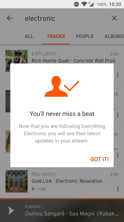
This is a good example of a tutorial message that isn’t too obtrusive, yet it adds value by popping up at the right place and time. Event triggers (e.g. following your first artist) are a necessity for tutorials that help rather than hinder. There’s little value in explaining the first five onboarding steps before the user has a chance to orient themselves with the first step.
For more on how mobile messages impact the user experience, have a look at this blog post on in-app messages.
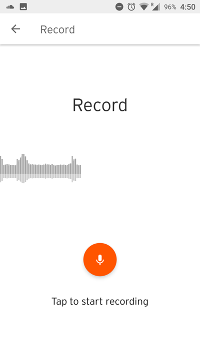
Moving on to the profile: there’s an innocuous “Record” button that takes you to a full-fledged audio recorder within the app! Once the recording is finished, you can publish the clip to your profile with a couple of taps.
This feature seems especially useful for podcasters, but it could add value for any artist as a place to jot down musical ideas.
And I appreciate the screen’s layout: it’s decidedly minimal compared to the rest of the app, with its pure white background. The simplicity makes the record button stand out all the move, further emphasizing Soundcloud’s brand color and the primary CTA of the screen.
One Way to Improve
The user profile on the Soundcloud app isn’t bad, but it’s missing one important feature.
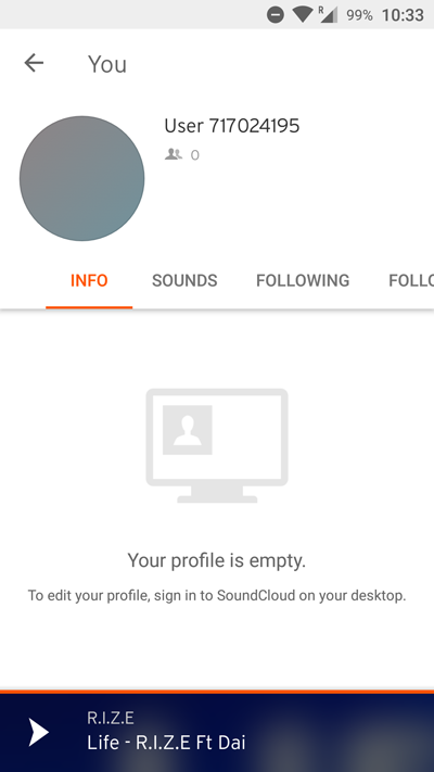
I would have gladly changed my name from User 717024195, but I guess that’s not possible on mobile!
In Soundcloud’s defense, this is probably more a technical issue than a UX issue. And the rest of the user profile is easy to navigate, with tabs removing the need to tap to a new screen.
A Minimal UI For Maximum Branding
If I had to describe Soundcloud’s mobile UI design in a word, I’d say it’s committed. I don’t think there’s a single color in the app besides the signature Soundcloud Orange. The branding is so consistent that the purple-orange gradient of Soundcloud Go feels like a drastic shift.
It’s impressive that such a simple two-color UI remains easy to browse. Separating UI elements into modules allows different shades of gray to do all the heavy lifting, making it easy to distinguish foreground from background. The CTAs and other clickable content are all highlighted in Soundcloud’s brand colors, which is win-win for the user and developer.
In terms of UX, the Soundcloud app is a go-to example of a text-heavy layout that’s browsable and branded. It’s proof that you don’t always need custom art and photos for a visually appealing design.
If you’re a mobile app designer with an interest in UX optimization, keep in mind that mobile marketing platforms like Leanplum offer versatile tools for A/B testing and layout editing. It’s hard to design a perfect user experience on gut feel alone; with A/B testing, your own users can help guide the design process.
—
Leanplum is building the marketing cloud for the mobile era. Our integrated solution delivers meaningful engagement across messaging and the in-app experience. We work with top brands such as Tinder, Tesco, and Lyft. Schedule your personalized demo here.