
Creating an engaging app experience is easy to learn, but hard to master. From onboarding to conversion, app marketers employ all sorts of techniques to keep users engaged. After all, in the mobile world, attention doesn’t come free.
For our new blog post series, we’ll break down the engagement strategies of popular apps to see what they excel at and what they could improve. By diving into the nitty-gritty of user experience, we hope to discover what exactly it is that makes popular apps as engaging as they are.
I’m kicking off the series with an analysis of Airbnb’s mobile app. Read this App Engagement Analysis for a detailed look at my experience in Airbnb’s new user flow, from onboarding to first booking.
Onboarding
What Airbnb does well: simple, step-by-step onboarding
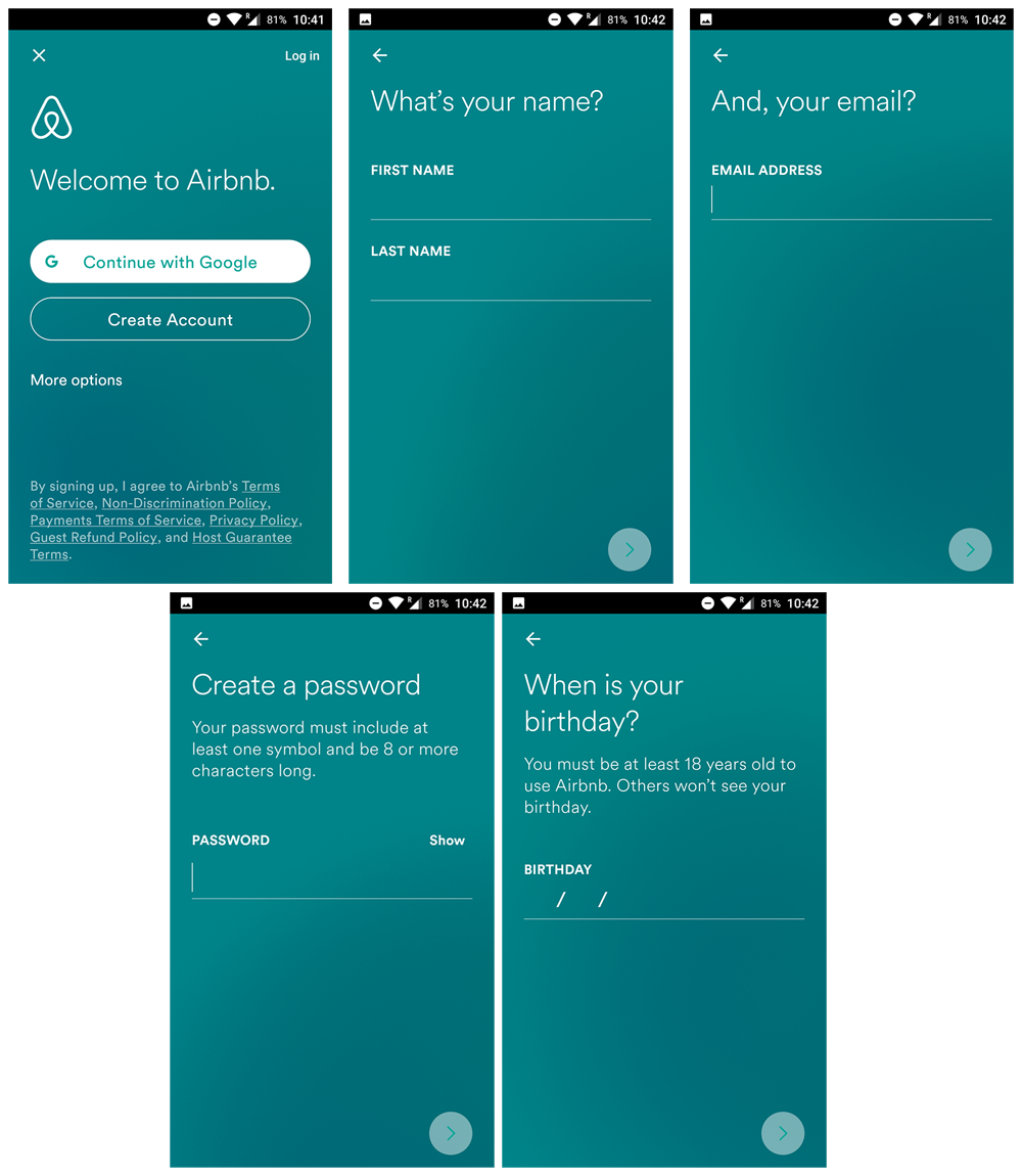
Airbnb’s onboarding flow starts out strong with a series of full-screen forms. Five screens might seem like overkill for a simple account creation, but because the screens contain only one question, each step is easier to digest.
The conversational language also helps ease users along. The copy on screen two and screen three flow together like a conversation: “What’s your name? And, your email.” This makes the process feel less like a generic form.
One Way to Improve
The initial onboarding process is painless. However, one solution that might help users speed through it is a progress bar. By allowing users to see how much longer they have left in the onboarding process, Airbnb can motivate users who drop off early in the funnel. A quick A/B test is an easy way to see if this solution provides value.
Engagement
What Airbnb does well: customized filters, easy exploration
Once onboarding is complete, the app drops us onto the main screen. The “For You” tab displays experiences prominently, encouraging users to browse Airbnb’s non-housing listings. The company now catalogs local experiences and tours in addition to homes, so this is a good way to encourage users to explore new parts of the app.
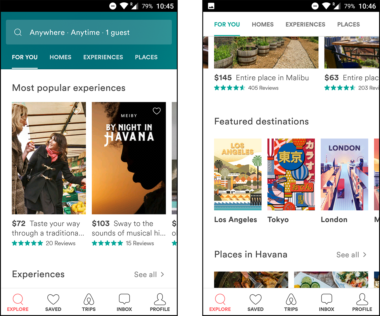
After scrolling past a couple of rows, we reach the “featured destinations” carousel (pictured on the right). These links help users filter results to a specific location.
I’m still early in the customer journey with this app, but it already earns points for user-friendliness. As shown above, you can customize the filters on the main search by simply scrolling up. The filters and navigation bar fade away seamlessly as you scroll back to the content.
Furthermore, the app waits until this point to request your location. This is a good move because the value of sharing location data is clear when you’re filtering to listings near you.
Likewise, the loading screen adds flair to an otherwise dull part of the user experience. Upon closer inspection, it’s clear that the loading icons are simply looping, but this isn’t immediately obvious (but it’s a cute addition nonetheless).
One Way to Improve
This home screen succeeds at delivering a vast amount of information at once (each row is a scrollable carousel). But it could be even stronger with more personalization.
Even after browsing the app for a bit and bookmarking a trip, the “For You” tab didn’t attempt to suggest more homes or experiences in that destination. In fact, the “most popular experiences” row remained first on the list, even though I had shown interest in traveling elsewhere.
Profile
What Airbnb does well: intuitive customer support
Deep in the Profile menu, I discovered a couple of unexpected features.
1. There’s a tiny button in the About screen that reads “Why Host?”
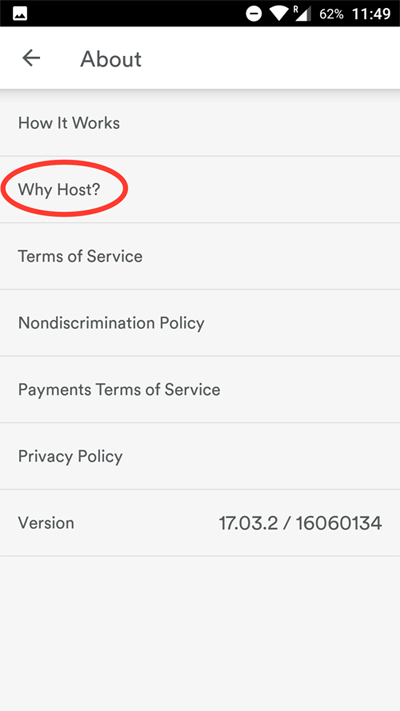
This nondescript button actually directs to a beautiful onboarding flow for potential hosts.
It feels as if a good amount of work went into this flow, yet it’s tucked away in the About screen! Meanwhile, there’s a “List Your Space” button on the user’s profile that skips this onboarding flow and jumps straight into the application process. It’s far easier to find the latter button than the former.
2. There’s an interesting setting called “shake to send feedback”.
I had accidentally discovered this feature while recording videos for this post. My screen recording app is set to stop recording when I shake the device. Little did I know that the shake would also trigger a feedback form within Airbnb!
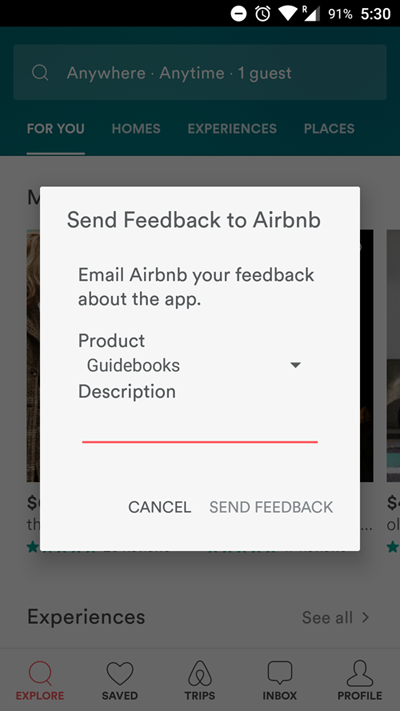
This subtle UX decision may very well have saved Airbnb from negative App Store reviews. The assumption, of course, is that an angry or frustrated user is likely to shake their phone. In this event, the popup provides a one-click means to email customer support. From a user standpoint, this is intuitive and brilliant.
In the heat of the moment, it’s much easier to fire off an angry email at customer support than to manually open the App Store listing and leave a review. Furthermore, by keeping users in the app, Airbnb can better understand the steps that led up to the person’s frustration. It’s a win-win design decision.
One Way to Improve
While these features are excellent, an improved navigation flow in the first app open can help a new user explore features that they may find helpful. After a user registers, Airbnb could A/B test a series of in-app messages that point users to these screens.
Listings
What Airbnb does well: bright calls-to-action, streamlined design
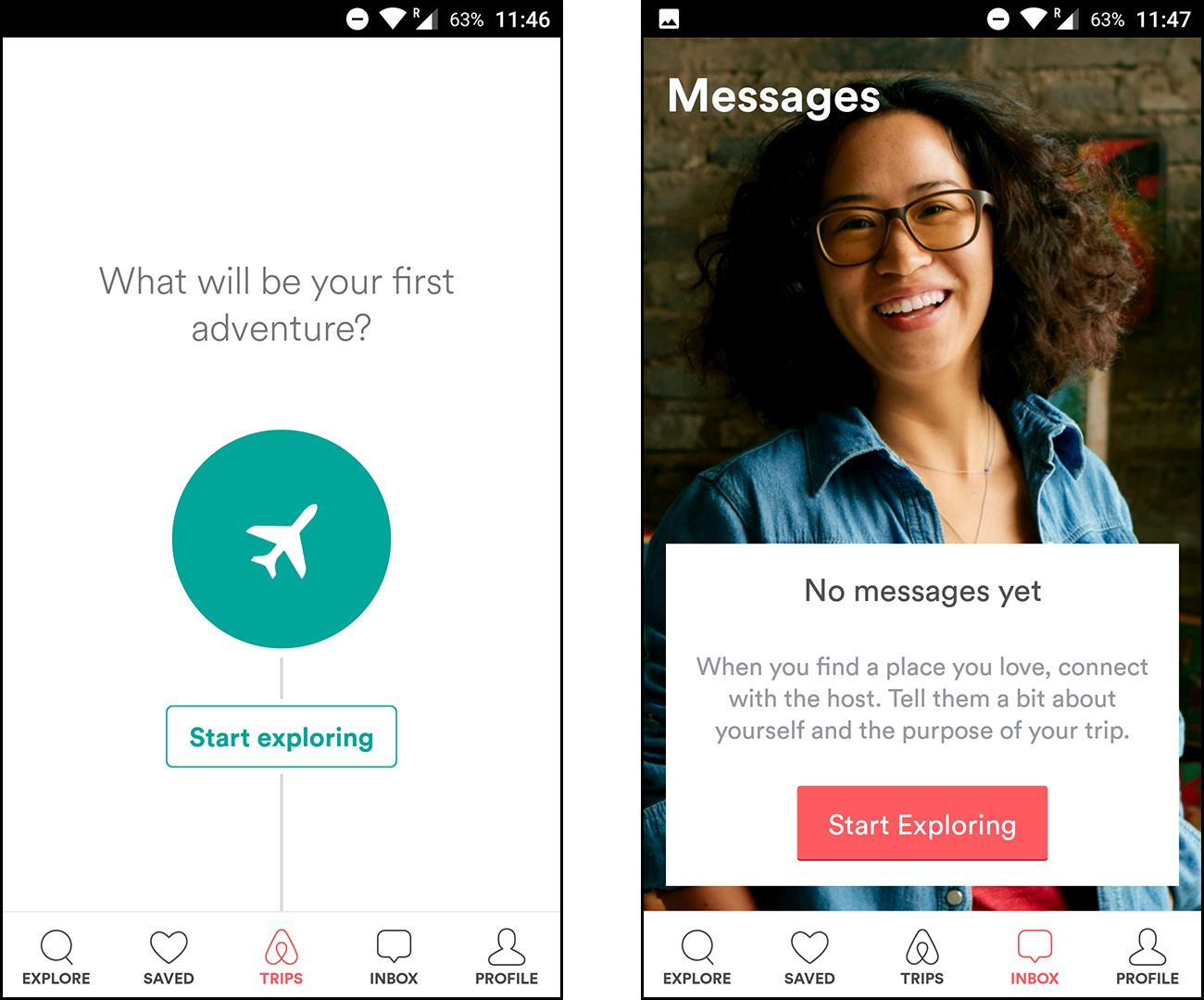
The Airbnb app does a very good job of prompting new users to explore listings. As shown above, the Trips and Inbox menus don’t simply display a blank screen when they’re empty. They both offer a call-to-action button that redirects users back to the Explore menu.
The “Homes” tab is more streamlined than the “For You” tab. Each listing occupies the full width of the screen, and it’s a simple vertical scroll all the way to the button.
As shown above, animation bridges the gap between the listing screen and the search screen, creating the illusion of a single, connected interface.
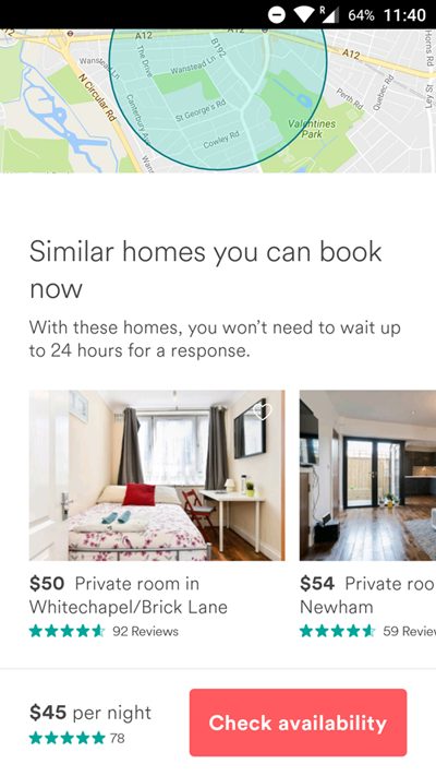
The listing pages provide all the information users might need. Airbnb wisely includes a “similar homes” carousel at the bottom, leveraging personalized recommendations to help users explore.
One Way to Improve
My only issue with the listings page is the map. While the map view on the Explore tab displays a precise pin for each home, the full listing page shows a wide circular range, as in the image above.
It’s true that Airbnb listings only display a postal code and neighborhood rather than a precise street address. But the pins on the Explore tab imply that the app is telling us the exact location of the listing, not just an estimate.
Booking
What Airbnb does well: account creation
This brings us to the final step: the checkout flow.
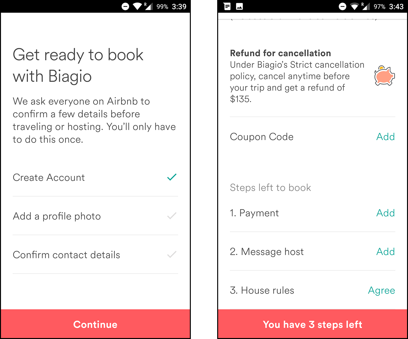
My account was new, so when I attempted to book a place, the screen on the left popped up.
It’s smart that Airbnb delays the contact confirmation step until deeper in the customer journey. At this point, a user has already found a home or experience they’d like to book, so spending an extra minute to confirm contact details isn’t a big deal.
One Way to Improve
This may come across as misleading for first-time users because it takes even more information to make your first booking. The left screen doesn’t make it clear that there’s more to the booking process, but even after confirming your identity, you’re greeted with the three steps shown on the right.
That said, splitting up the two flows may be for the best. Three is a digestible number of tasks; anything more starts to feel like a chore. And of the six tasks shown above, four apply only to first-time users, so the checkout process will become much simpler for subsequent bookings.
Booking Abandonment
What Airbnb does well: abandonment campaigns via push notifications
Finally, it’s worth noting that the app sent me a push notification reminder 24 hours after browsing a specific listing.
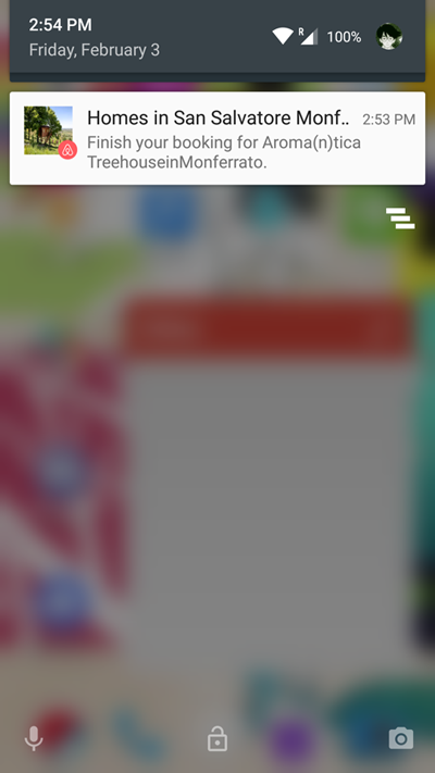
Interestingly, I had not explicitly shown interest in this listing by favoriting it. I believe the app selected this listing either through a number of clicks or time spent on-screen. Either way, this push notification signals that Airbnb is running an effective automated messaging flow under the hood.
This push notification is effective because it helps turn my interest into a conversion. I had already shown interest in this listing, whether by added it to my favorites or spending several minutes reading the details. The app capitalizes on this indication of interest with a call to action that prompts me to complete the booking.
One Way to Improve
This call to action is a good start, but it could be enhanced with deeper personalization. Including a user, the parameter could increase engagement because it makes the message feel more direct. It’s great that the message includes the listing and location name, but the copy could be spiced up even further with user-specific data.
This is also a good opportunity for multi-channel outreach. While I provided my email address during the signup process, I only received this message via push notification, not email. Reaching out on both channels could prove effective for users who don’t want to complete the transaction on mobile.
Engagement Analysis Results: How Can Airbnb Improve?
From the screens and flows I’ve highlighted in this engagement analysis, it’s pretty clear that the Airbnb mobile app already offers a superb user experience. The design and animations are visually appealing, and the content is plentiful but not cluttered.
If there’s one way the app can take its engagement strategy to the next level, it’s through personalization. By better leveraging browsing habits, Airbnb could deliver more targeted recommendations across the app, increasing conversions — and delighting users — in the process.
—
Leanplum is building the marketing cloud for the mobile era. Our integrated solution delivers meaningful engagement across messaging and the in-app experience. We work with top brands such as Tinder, Tesco, and Lyft. Schedule your personalized demo here.