
It’s my favorite time of year — the deliriously giddy time in between back-to-school nostalgia, pre-holiday excitement, and that moment when the air shifts from overwhelmingly humid to pleasantly brisk.
’Tis the season to shop ’til you drop, too.
Enter Farfetch. Farfetch is an online luxury fashion platform based in London that sells products from more than 700 brands around the world. The concept is a fashion-lovers’ paradise. But does the digital experience live up to expectations?
I downloaded the app to find out.
First-Time User Experience
What Farfetch Does Well
The Farfetch onboarding flow is noticeably minimal. The first thing I see is a prompt asking whether I want to “shop women” or “shop men.”
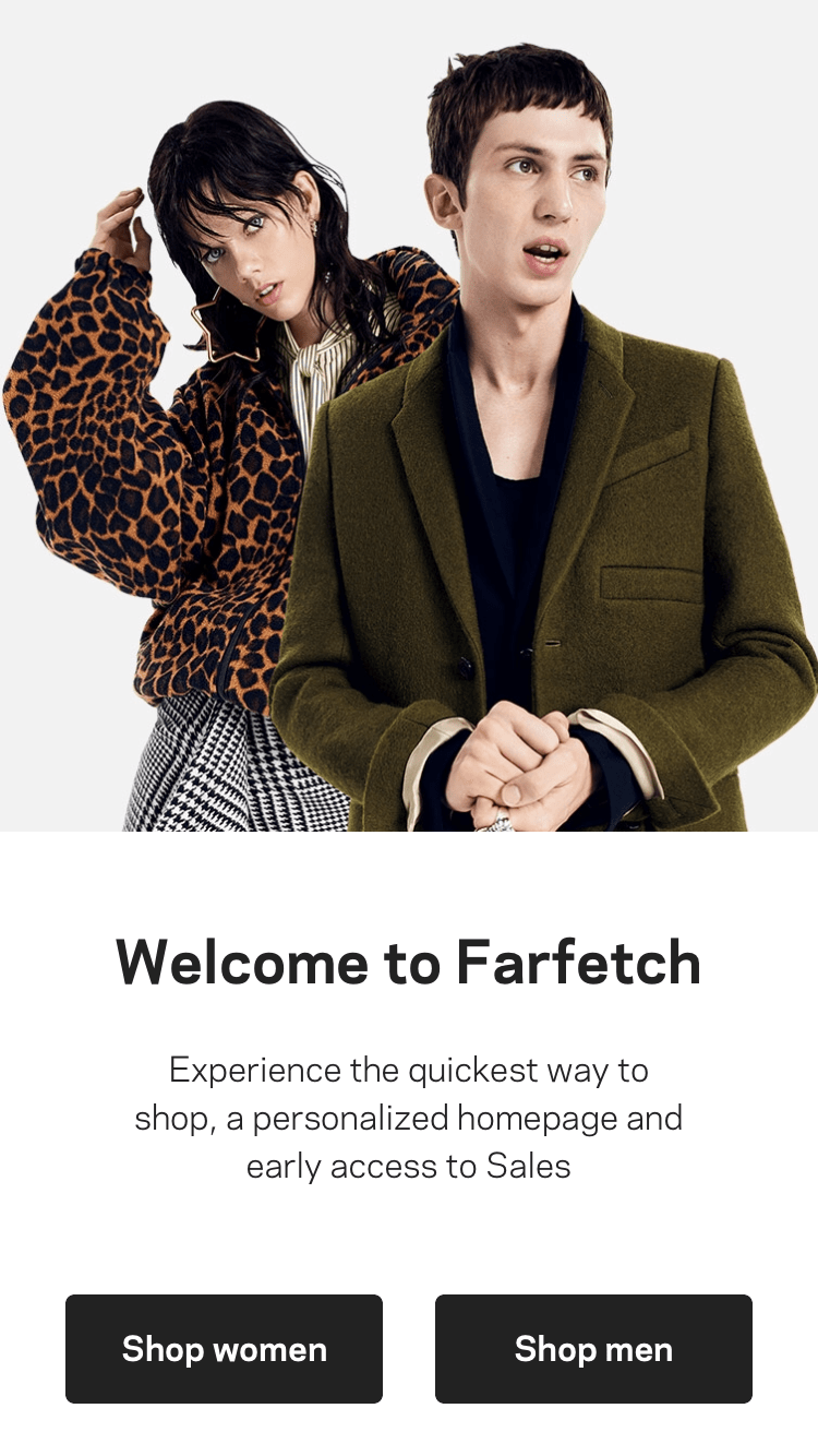
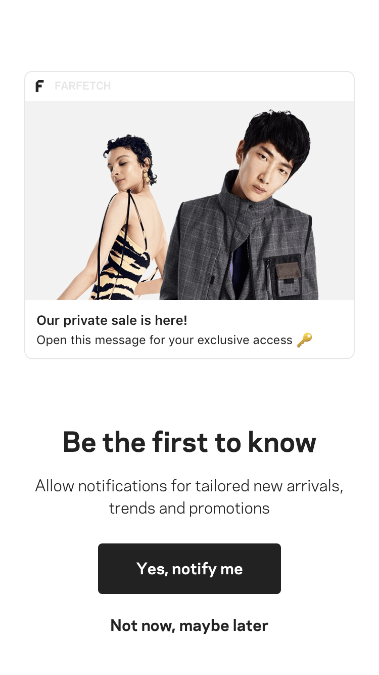
I select “shop women” and then the app immediately asks me to opt-in to push notifications. The copy is friendly and thoroughly explains the benefits I will receive if I opt in. Even though it feels premature — I don’t even know if the app has anything good to offer — I decide to allow notifications and move to the next screen.
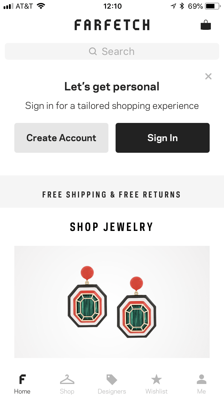
Next, the app asks me to create an account. Luckily, there’s a Facebook API that makes it a no-hassle process. And as a bonus, the app even offers to let me sign in next time with Touch ID.
Within a few hours of completing downloading the app, I receive not just a push notification, but a rich push notification. It alerts me of a clearance sale. This is great, as we here at Leanplum are firm believers in multi-channel onboarding that reaches users both in and out of the app.
The image — a simple graphic touting “SALE” in large letters — is eye-catching and effective in drawing users back into the app. After all, who can resist a good deal? I know I can’t.
One Thing to Improve
Users generally reap the most benefits from an app by becoming a member, and the option to create an account is presented during a user’s very first experience with Farfetch. However, the benefits of signing up for a membership are never explained.
In the future, Farfetch might address this via a small in-app message that introduces the value of being a member, incorporated into an introductory screen.
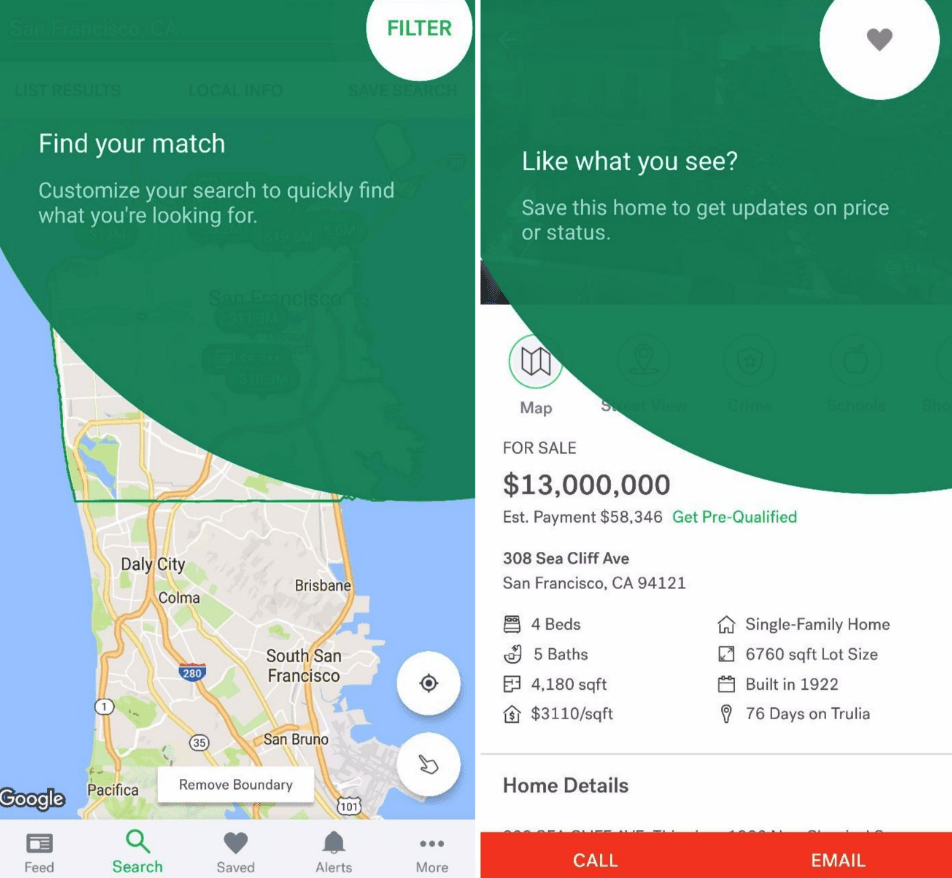
To illustrate what I mean, I really like how Trulia incorporates non-intrusive pop-up messages that can be easily dismissed throughout the first-time user experience.
Farfetch might even try adding one additional screen to the onboarding flow touting membership perks.
To see if these extra efforts impact the volume of sign-ups, what if Farfetch ran a simple A/B test with one group of users introduced to the benefits of a membership, while another group not? The results would let Farfetch move forward confidently, whatever the decision.
Here’s another way to improve the initial experience. A coworker, an American expat living in Amsterdam, alerted me that when he downloaded the app, it opened in Dutch for him. Defaulting to the language based on a user’s device settings, rather than location, would ensure some shoppers aren’t alienated from the start.
In-App Experience
Main Menu
The Farfetch app has five main menu items: Home, Shop, Designers, Wishlist, and Me.
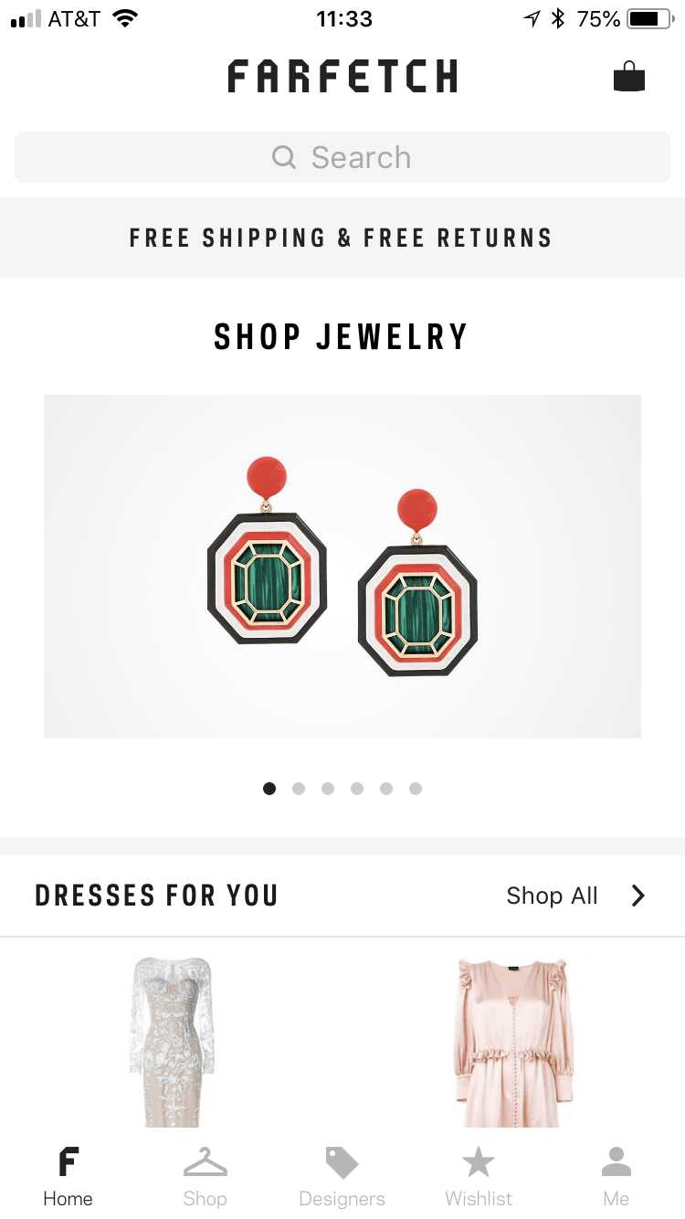
Home: Farfetch’s homepages leads with an announcement for a current sale, a CTA to “Shop Clothing,” and categories for new products, shoes, in-season clothing, and varying brand and accessory types.
A standout on this page is the “Recommended For You” section, where I notice items of clothing that I previously viewed — good for keeping them top-of-mind. As I continue to use the app, this feature will hopefully become even more sophisticated, saving me time by recommending outfits in line with my sense of style.
Shop: Farfetch’s “Shop” page categorizes the app’s various offerings so they are easily discoverable by users.
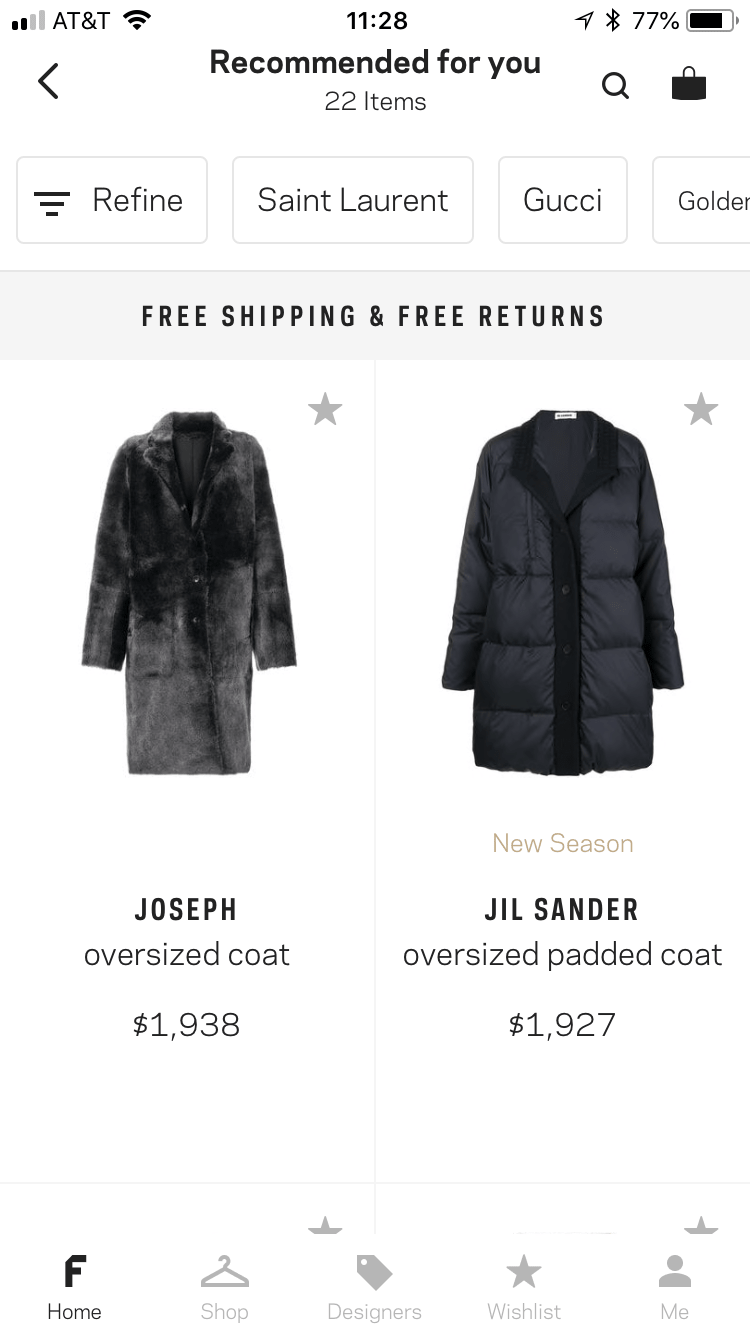
Designers: This screen lets you browse by various designers, like Saint Laurent, Prada, and Gucci.
Wishlist: The “Wishlist” screen is exactly what it sounds like — a place for you to store your favorite items. The “Get inspired” link sends you back to the home screen, where you can shop by category, recommendation, designers, etc.
Me: Finally, the “Me” page gives you control over your account, preferences, settings, and support.
One Thing to Improve
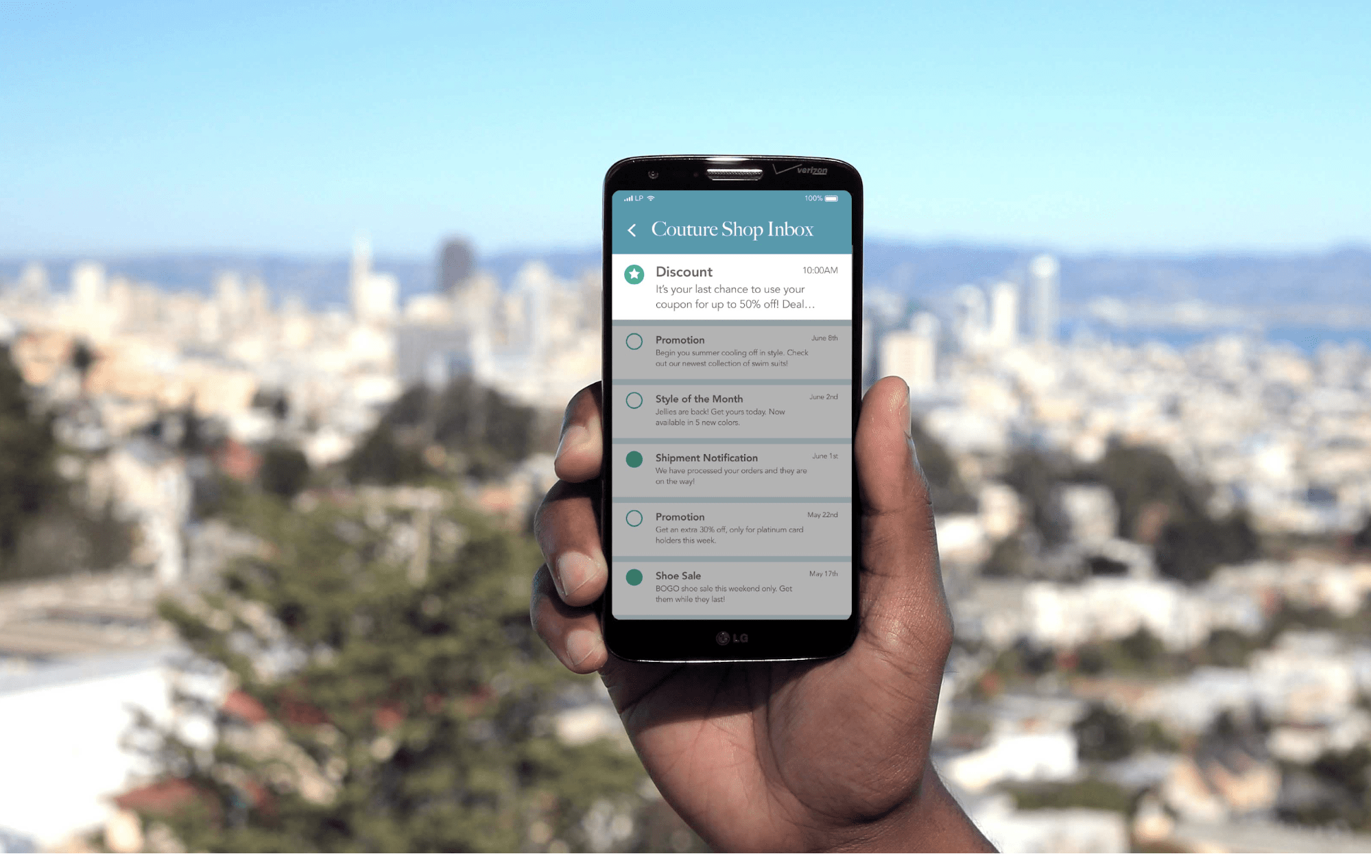
I’m already unsure where to go if I want to take advantage of the sale I saw earlier. A single message is too easily buried under notifremoveications from the dozens of other apps on my phone. It would be helpful to have one place where I could access promotions and other communications.
Leanplum’s App Inbox is a great solve for this. App Inbox is essentially a screen within an app that stores persistent messages — kind of like an email inbox, but it lives inside the app itself. And because App Inbox lets you store messages, you can promote more than sales, like tailored recommendations, making it a solution every retailer can benefit from.
For Farfetch, App Inbox would look something like this.
Shopping
What Farfetch Does Well
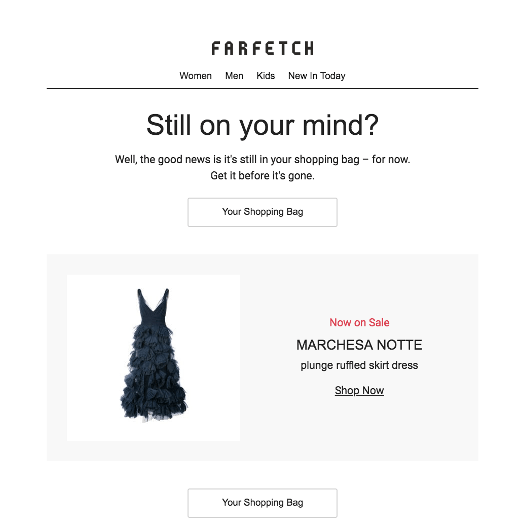
I go straight to Farfetch’s sale section (because let’s be real, I can’t afford to buy luxury brands), and select from dresses before settling on a deliciously extravagant silk ball gown from Marchesa Notte. The product details page offers information about fit and materials — but the “about this designer” section is blank.
Nevertheless, I select my size and add it to my cart.
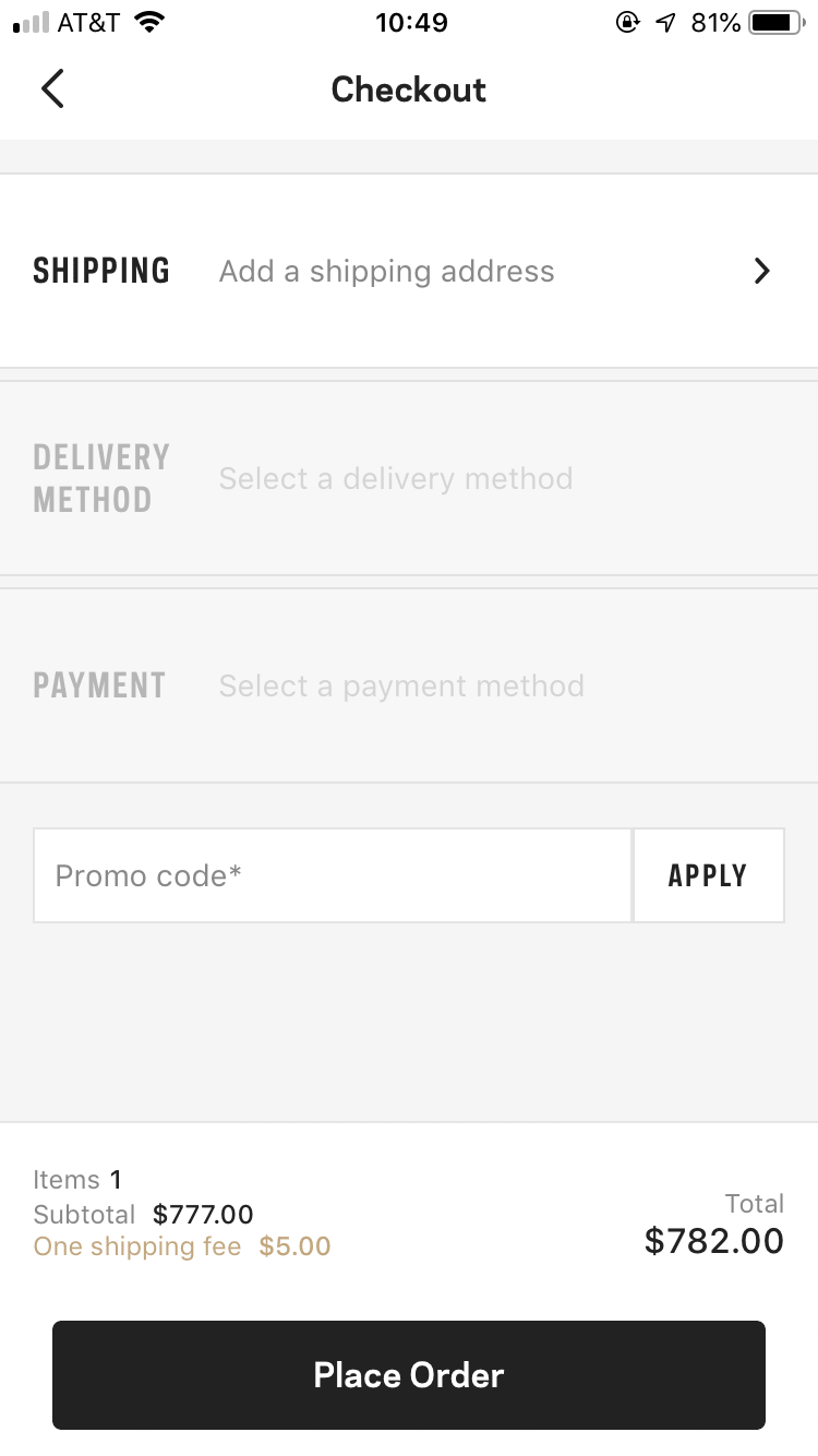
Checkout is straightforward. The app imports my name for shipping from the account I created, which means less to input manually. It would streamline the process further if the app auto-filled line items like my address, phone number, etc., based on my phone’s contact card.
One Thing to Improve
As a member, my item was saved in my cart. But that same friend in Amsterdam, a non-member, said the item in her cart disappeared. She also never received a push notification reminding her to check out. Even though the app didn’t have her email address (after all, she never registered), a simple push notification could have worked. Or even an in-app message directing to her to the checkout screen the next time she opened the app. Instead, the dress, and her memories of it, were lost in a mobile shopping vortex.
Re-Engagement
What Farfetch Does Well
Soon after I left the app the first time, I received a welcome email and push notification. +10 points to Farfetch for an excellent cross-channel onboarding approach.
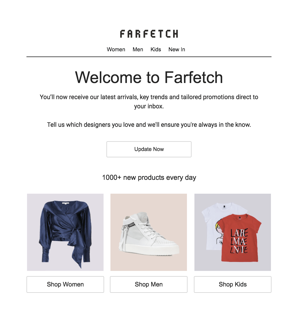
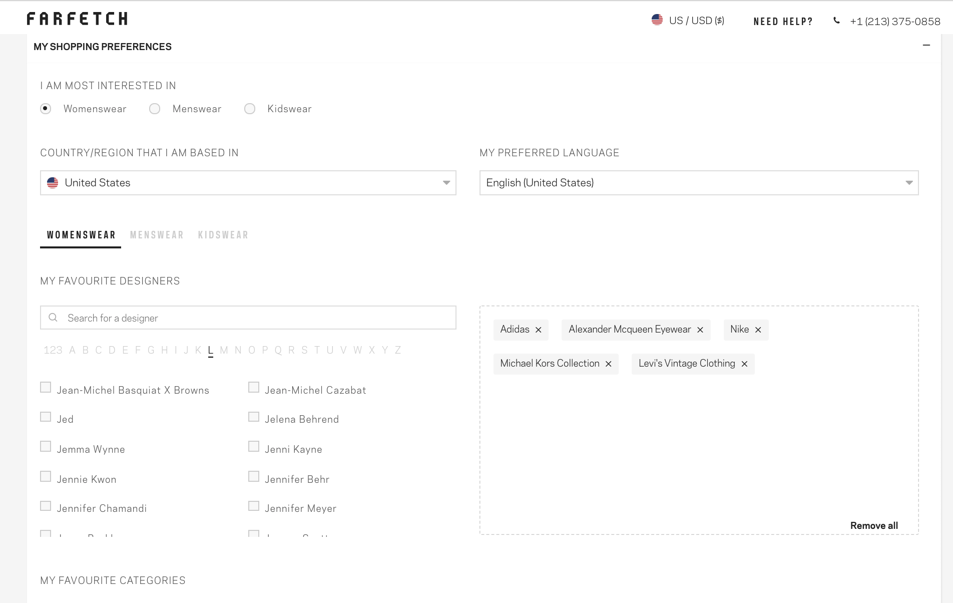
In the email, Farfetch pushes me to update my profile by selecting brands I want to see more from. I select a few and hit “update” at the bottom of the page.
I later receive another email about “4 reasons to choose Farfetch,” touting four reasons the app will be great to use. It seems I’m dropped into a welcome series to acquaint me with the all the benefits of the app, including free returns and multilingual customer service.
In terms of that dress I added to my cart and then abandoned, Farfetch sends me an email the next day reminding me to check out, and a push notification the day after.
One Thing to Improve
Farfetch does a great job coordinating emails and push notifications for a one-two punch that reminds you to convert. But not all their messages are based on behavior.
In the weeks after I added my favorite brands to my profile, I don’t get a single email about those brands — what a lost opportunity. Instead, I receive fun, but generic, emails about knitwear and other offerings.
Personalizing communications based on brand preference is an easy but powerful way to increase re-engagement.
Farfetch: Does the App Experience Check Out?
For a shopping app, Farfetch does many things well. The app itself is easy-to-use, messages are coordinated across channels, and a quick onboarding nurture series makes sure I understand how to get the most out of the app.
A few easy improvements in the engagement realm, like sending push notifications to non-members about abandoned shopping cart items and more behavior-based messages about favorited brands, would make the app unforgettable.
If you’re in the mood to shop-til-you-drop, give Farfetch a spin.
___
Leanplum is a mobile engagement platform that helps forward-looking brands like Grab, Tinder, and Tesco meet the real-time needs of their customers. Schedule your personalized demo here.