
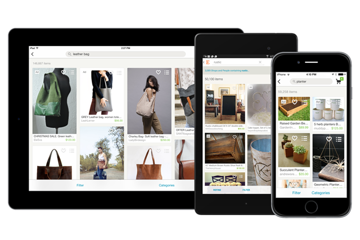
Welcome back to our App Engagement Analysis series! In the last post, we downloaded the Airbnb app and explored every facet of its user experience. This time, the subject is Etsy. This e-commerce company isn’t afraid to break a few mobile app rules, and its app is all the better for it.
 Source: Etsy
 Source:
 Curious? Read on to see how Etsy translated its shopping experience from web to mobile.
Onboarding
What Etsy does well: conveying value the minute the app is opened
Etsy’s onboarding flow is one of the most unique I’ve seen, for a very simple reason: it barely exists. This is the first screen you see when you launch the app.
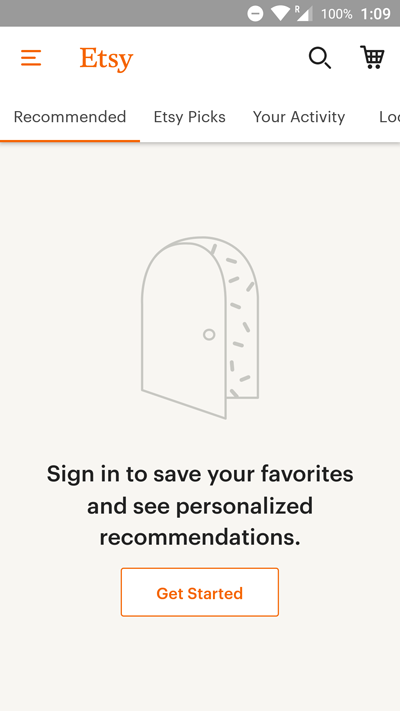
A more traditional onboarding flow would linearly guide users through each step in the process. This makes it impossible to accidentally skip the onboarding, which can be a good thing — but it also removes the element of choice.
Etsy’s onboarding drops users right into the action. It’s still obvious that the next step is signing up, thanks to the call-to-action occupying the Recommended tab. But if you’re so inclined, you can skip this step and browse products under the Etsy Picks tab. The app suggests creating an account, but it doesn’t force your hand.
One Way to Improve
While the CTA on the Recommended tab is effective, the registration page is a bit more intimidating.
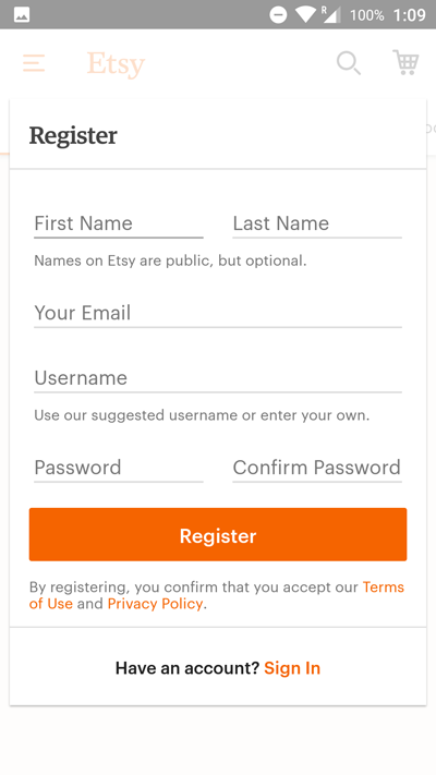
This screen isn’t bad, but a multi-screen flow that only asks one or two questions per screen might be more effective. Apps that place too many forms on one screen risk scaring off hasty users.
Plus, this registration form is technically a modal: it’s overlaid on the main app screen. This means if you accidentally tap the corner of the screen, the modal will close, erasing any content in the form.
With so many text fields in one place, this is a (relatively) high-stakes situation for the user. You wouldn’t want to type your email and password only to lose it all with a misclick.
Engagement
What Etsy does well: encouraging users to explore each category
The Etsy app is a pleasure to use once you start browsing. Below are a pair of screenshots from the Etsy Picks and Editors’ Picks sections.
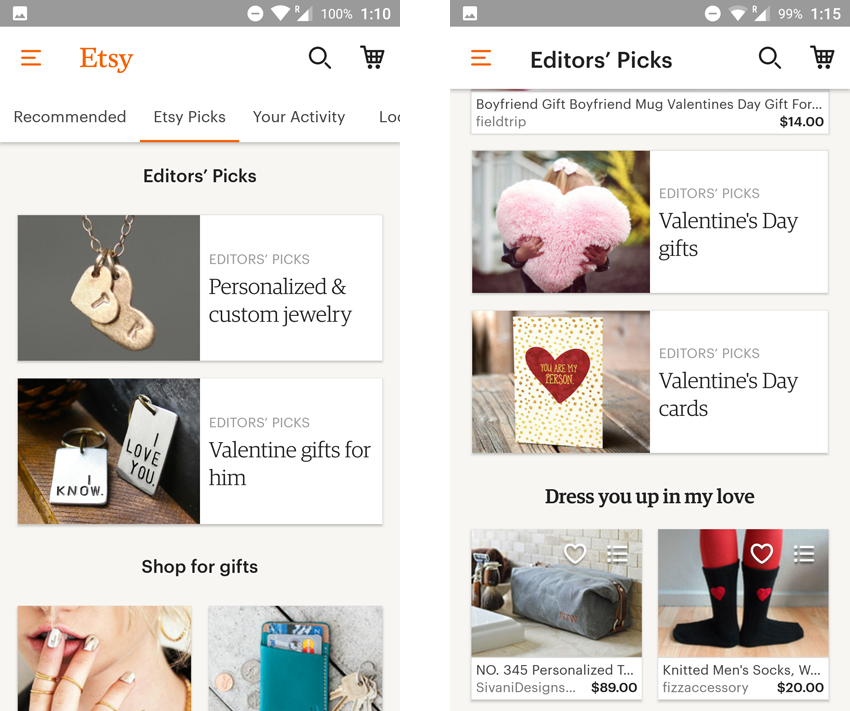
The Etsy Picks tab starts with a few seasonal categories. Tapping one of them brings you to the screen on the right, which features a variety of product suggestions. Scroll down a bit and you’ll see links to other relevant Editors’ Picks categories.
If you instead chose to keep scrolling down the Etsy Picks section, you’d eventually come across recommendations for specific products and popular stores.
The screen is a bit busy, but it remains easy to navigate thanks to the headers. Overall, I’d say it succeeds at introducing users to the many ways they can browse the app — whether by category, product, or store.
One Way to Improve
The browsing experience in Etsy is phenomenal. I only have one possible point of improvement: the ad placement is a bit too effective.
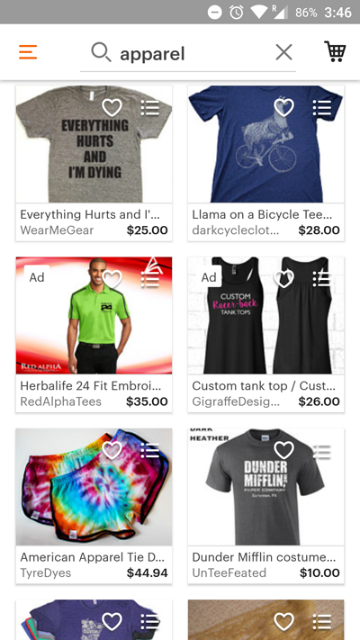
As you can see, product ads are mixed in with search results.
True, this is standard practice in other commonly used products like Google search. But in Etsy’s case, the ad button doesn’t visually stand out, causing the paid listings to blend almost seamlessly into the results.
This outcome is probably desirable for increasing ad engagements, but it may hurt the app experience. Coloring or changing the shape of the ad units would help users identify paid listings at a glance. This would attract more attention to the ads while being less deceptive.
Personalization
What Etsy does well: offering granular product suggestions
Personalization is huge for retail apps. Marketplaces like Etsy offer such an array of products that very few people will care to browse the whole store. Suggesting the right product at the right time could make the difference between a successful conversion and a failed one.
When I created a new account, the app defaulted to suggesting seasonal gifts, as shown in the previous screenshots (they were taken before Valentine’s). A fair assumption, since the app has no other data on me.
As a test, I browsed around and favorited a few items to see what the app would suggest. Here’s the result.
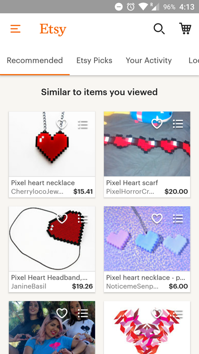
I guess I clicked on a few too many pixel hearts! All of these recommendations are pretty similar, but to be fair, I hadn’t browsed much yet. After adding another five or ten items, here’s what the app suggested.
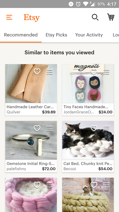
It may not be obvious at a glance, but all of these recommendations are hyper-specific. I had previously viewed a leather card holder and knit cat bed. Rather than offering broad suggestions from my most browsed categories, the Etsy app hones in on the specific items that I showed interest in.
On a different note, the app succeeds at weaving in location-based personalization.
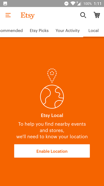
Etsy doesn’t send a message requesting location access; it waits until users scroll to the Local tab of their own accord.
As this is the last tab in the main screen, there’s no guarantee that users will even find it during their first session. But by the time they do, the value of sharing their location will be obvious. This is a subtle, non-pushy way of securing the permissions needed to deliver a more personalized experience.
One Way to Improve
Etsy’s approach to recommendations is good, but it could still be improved.
If I were in the market for a specific item, the granularity of these recommendations would probably increase my odds of converting. But note that the pixel heart suggestions from my first session were already gone by the second screenshot.
These recommendations are very reactionary; it’s as if the app forgot what I searched for during my previous session, even though it was just a few minutes prior.
I’d suggest mixing in some more high-level, long-term suggestions. Our personalization tools and perfect for this sort of campaign. By collecting user data across multiple browsing sessions, it’s possible to deliver recommendations that take overall tastes into account, rather than only matching by specific product type.
Re-Engagement
What Etsy does well: sending timely push notifications to prompt user engagement
One day after installing the app, I received this neat push notification from Etsy.
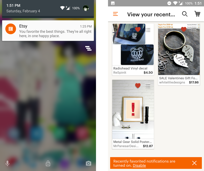
The message prompts me to act on some of the items that I previously favorited (and it does so with on-brand copywriting). Clicking the push notification brings me to the screen on the right, where it’s easy to resume browsing.
One subtle but critical point: the landing screen offers a one-click option to opt out of push notifications.
I’m on Android, which means that I never explicitly opted in to push notifications. I could’ve been annoyed at the unasked-for message — but if I was, the app makes it clear that it won’t bother me further. It’s scary to offers users the chance to opt out of push notifications, but it gives them one less reason to uninstall.
Of course, clicking “disable” here will most likely turn off the “recently favorited” campaign, rather than revoking permissions altogether. This still lets Etsy contact me for a different promotion.
What’s more, I received this email after confirming my account.
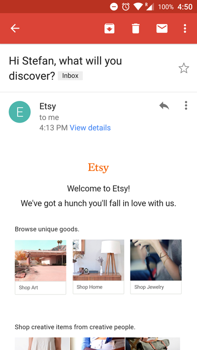
The content is straightforward, but welcome emails help start the customer relationship on the right foot. And in the case of a consumer app like Etsy, it offers a chance to show off their unique style and brand voice.
These three messages — push notification, in-app, and email — synergize to create outstanding app engagement.
The push notification would’ve been weaker if not for the in-app message offering a chance to opt out; the email would’ve been too soft for a first impression by itself. But together, these messages made a great impression on me as a new user.
That’s why Leanplum powers multi-channel messaging. It’s rarely enough to target users on just one channel. What if the person opts out of push notifications? Or what if they don’t check their email? With a full-fledged messaging platform, you can pick the right channel for the person.
How Can Etsy Improve Its App Engagement?
Etsy does a great job of easing users into the app. While many apps are pushy during onboarding and over-eager to secure permissions, Etsy lets users discover content at their own pace.
The app already analyzes individual browsing history to offer personalized recommendations, but there’s room to go even further. With an analytics and segmentation platform that captures user data over the whole lifecycle, it’s possible to build a nuanced profile of each person’s unique tastes, rather than suggesting items based only on recent browsing sessions.
With greater personalization, Etsy could make its app even harder to put down.
—
Leanplum is building the marketing cloud for the mobile era. Our integrated solution delivers meaningful engagement across messaging and the in-app experience. We work with top brands such as Tinder, Tesco, and Lyft. Schedule your personalized demo here.