Source: Vecteezy
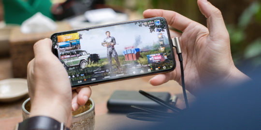
Mobile checkout optimization is a trending topic for retail apps around the world. 47 percent of top retailers have already created a mobile website or app for their brand, and the majority of web traffic comes from mobile devices, so it’s clear that mobile shopping is here to stay. But tablets and smartphones still have a lower conversion rate than desktop computers, meaning people are still more likely to make purchases on their home computers.
There’s a gap between the average consumer’s browsing habits and spending habits. Right now, it’s likely that your customers are doing product research and browsing your store on mobile — but many of them don’t click the checkout button until they’re on the computer at home. This gap between research and purchase could be a lost opportunity. Some customers might simply forget to make the purchase later, or they might log in at home and realize that their shopping cart is empty because their mobile browsing session wasn’t synced to their desktop browser.
With $$$ on the table, marketers can’t afford to lose shoppers on mobile. Retailers must optimize the mobile checkout process to close the gap between desktop and mobile and ensure that there are no points of friction in the funnel.
Before We Begin: What Is a Mobile Checkout?
For starters, mobile checkout can refer to two different (but related) things. The more common definition refers to the process of placing an order on a mobile app or website. In this case, mobile checkout means completing the checkout process on mobile.
Another definition refers to placing an order at a mobile device inside a brick-and-mortar store. A good example would be Apple’s retail stores. Apple Store employees can process transactions, check store inventory, and more, directly from their devices. This means that customers don’t have to line up and pay at the register — they can ask a salesperson for help, and immediately make the purchase right then and there.
Since our focus is on mobile apps, this post will mainly address the first definition: the process of making a purchase from an app vs a desktop website.
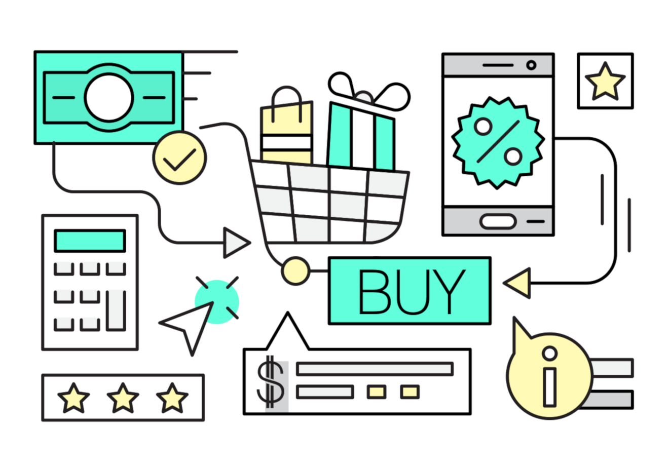
Optimizing the Mobile Checkout Flow
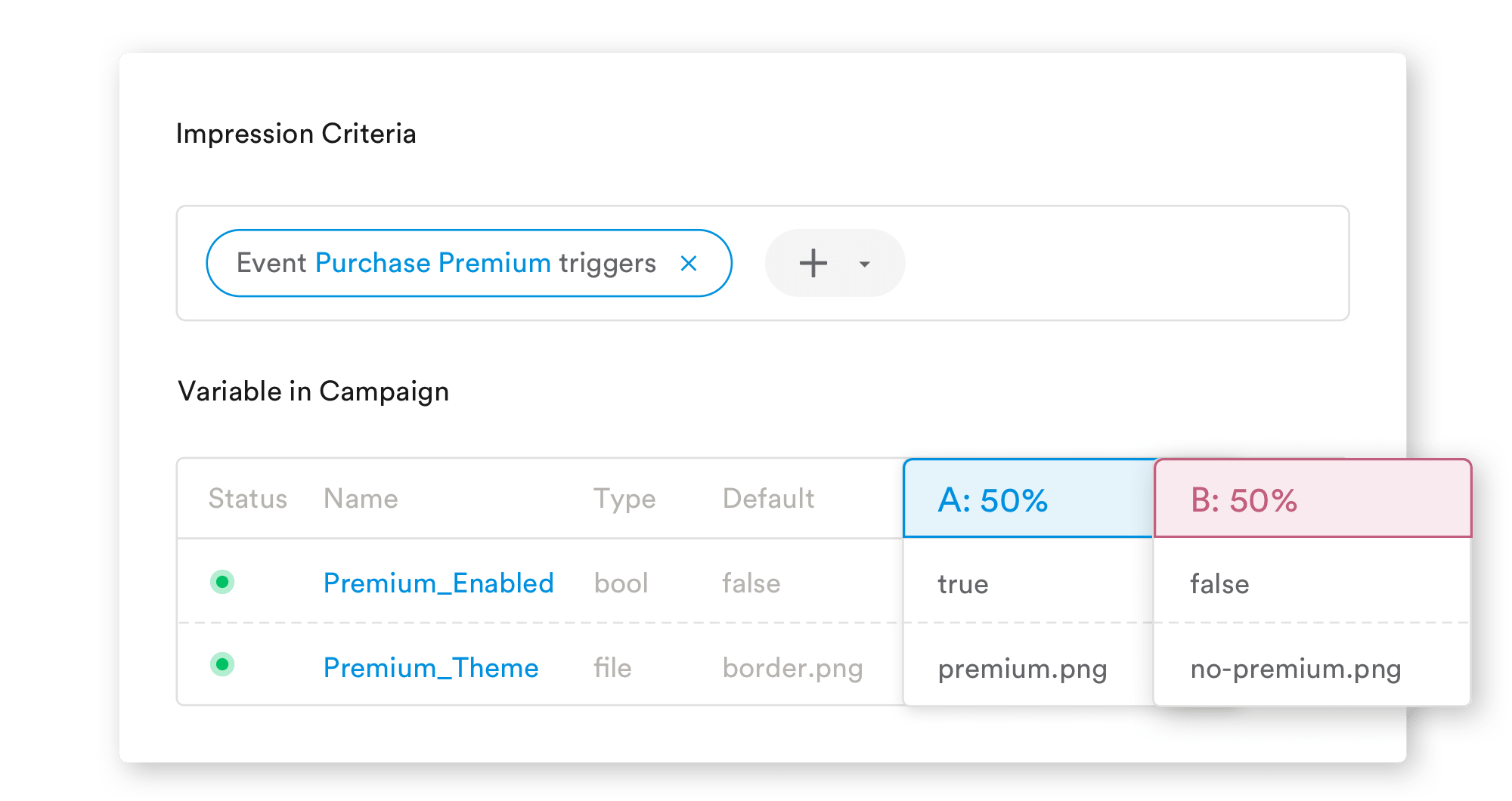
An example of how to A/B test app UX changes in the Leanplum dashboard
Lucky for us, there are countless techniques and resources to help retailers improve their mobile checkouts. Here a few tips we’ve come across:
- Add a “log in with social media” button to your checkout flow. Authenticating users with a Twitter or Facebook account is much easier than forcing new customers to register a new account just for a single purchase. (Source)
- Automatically switch keyboard styles for different types of forms. For example, the email address keyboard has an alternate layout that emphasizes the “@” and “.” keys, and the number pad keyboard makes it easier to type in phone numbers. (Source)
- Allow users to tab through form fields with up/down arrows on the keyboard, instead of forcing them to manually tap each individual field. (Source)
- Add express checkout options, such as the option to pay with PayPal instead of inputting your credit card info. This can be a huge point of friction in terms of UX, because a mobile user may not be in a situation where they can physically pull out their credit card and type in the numbers. (Source)
- On the order summary screen, place the order total above the fold. This ensures that users know how much they’re paying for the items, taxes, and shipping. If the order total is below the fold, some users might scroll past it by accident. (Source)
These are just a few of many techniques for mobile checkout optimization. As always, results will vary for each app, so be sure to A/B test your changes to confirm that they’re working the way you want them to.
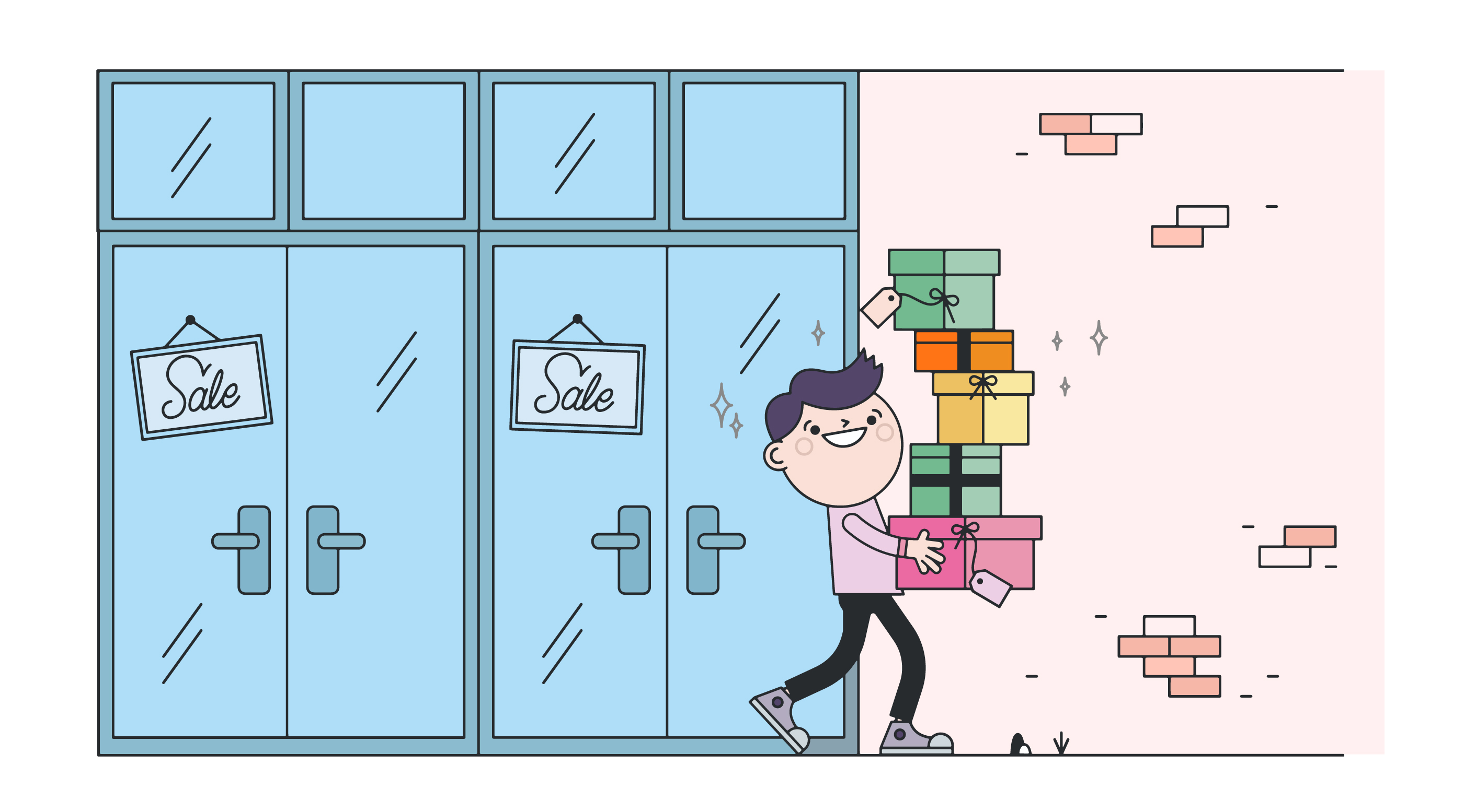
Digging Deeper Into Mobile Checkout Optimization
Source: Vecteezy
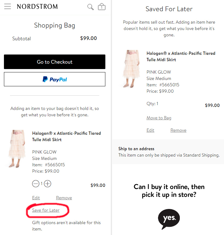
Now let’s go a little bit deeper. Let’s say you’re looking to solve a specific problem in your mobile checkout flow, like shopping cart abandonment. You’d like to make it easier for shoppers to browse and research on the go, and then complete the purchase when they have time to sit down and pull out their credit card.
One way to reduce friction in this area would be with a save cart for later option.
Source: GrowthRock
If you can’t close a transaction right away, the next best option is to have users bookmark items to purchase later. This way, if they forget to complete the purchase, you can usually send a follow-up message reminding them of what they’re missing out on.
Of course, it’s always risky to implement a new feature in your mobile checkout flow without testing it. We suggest A/B testing every major change to make sure that it works for your app.
But perhaps this still isn’t enough to solve your shopping cart abandonment problems. Another solution is to adjust the number of screens in your mobile checkout flow. Usually this means reducing the number of screens to make less work for the user. However, sometimes the opposite is more effective — in some cases, creating more screens with less information per screen could make the form fields easier to digest.
In either case, you would use a feature like Leanplum’s App UX tweaker to create different versions of the checkout flow and bind them to a variable. Then, you can selectively toggle the new or old flow for different segments of your user base. You can also use this toggle for A/B tests, just like with the save for later button.
One more example: Tesco, one of our customers, used Leanplum to A/B test several different versions of their mobile checkout screen. Tesco’s first attempt at optimizing its checkout flow actually had a negative effect — the change led to a decrease in items added to the cart. However, a few iterations later, the app team was able to develop a flow that increased items added to cart by 3.3 percent.
These are just a few examples of the many possible optimizations an app team can do for their mobile checkout flow. Still, this should give you an idea of how to implement (and test!) a UX tweak without jeopardizing your current conversion rate.
The First Step to a Better Mobile Checkout Flow
If you want more mobile checkouts, the first step is to find a suitable mobile marketing platform. You will need robust analytics tools to study the conversion funnel and identify points of friction, and it’s always recommended to A/B test every change to ensure that you’re not doing more harm than good.
Leanplum offers both of these features and more. If you’d like to learn more, schedule a personalized demo today.